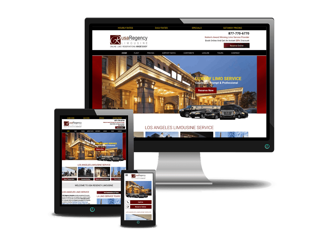

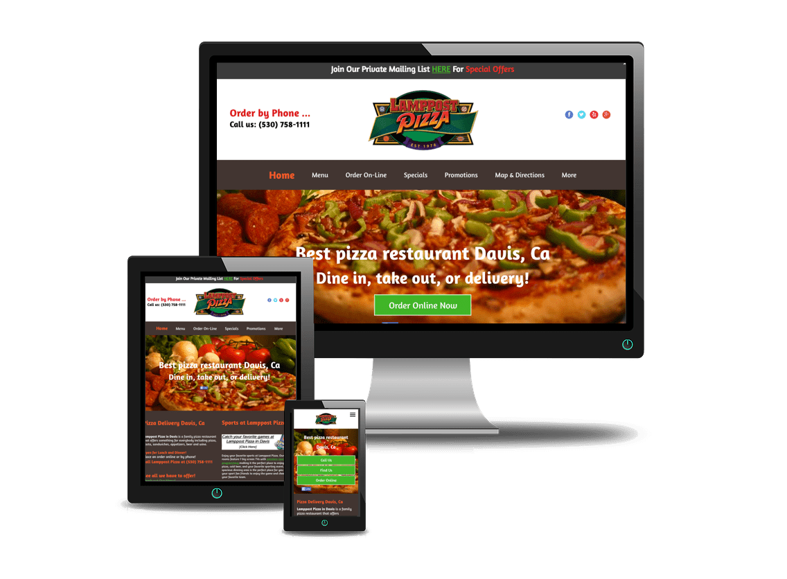
Responsive Web Design
3-in-1
Mobile Web Integration

A
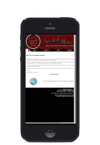
responsive web design is a 3-in-1 website which automatically converts for desktop, smartphone and tablet. The website is responsive to format and display properly depending on the size of screen that is viewing your website.
Our website is a responsive web design, so you can view it on different devices to see how it auto-formats to each device for premium user experience.


Mobile Web Design

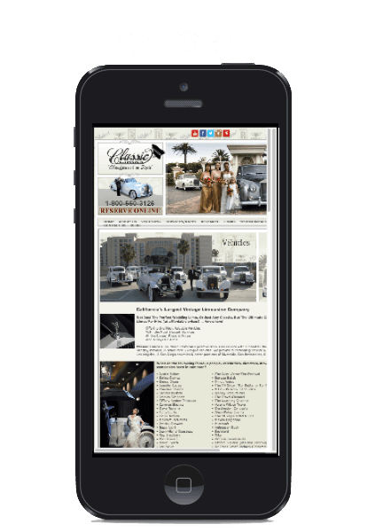
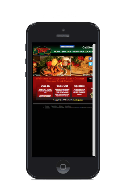

A mobile web
design gives your business an immediate mobile presence for any customer visiting your website on any smartphone.
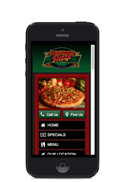
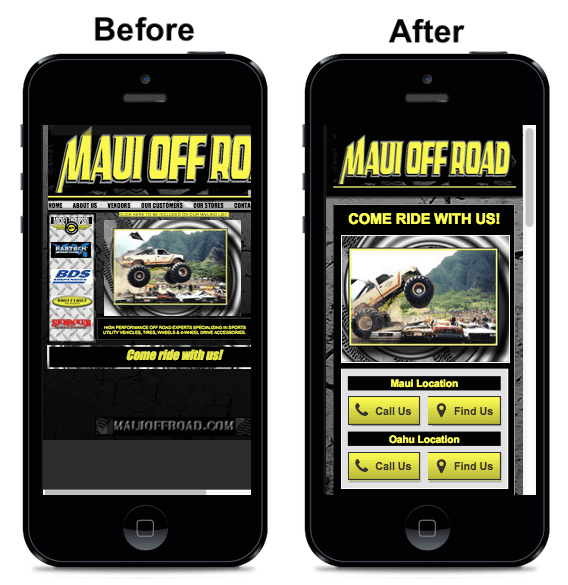
Once the site is built, if someone visits your website on a desktop or laptop, your site displays as it normally does. However, if someone is viewing your site on a smartphone, it will recognize it and automatically reconfigure to their phone in a mobile friendly format without having to force anyone to download anything such as an app.


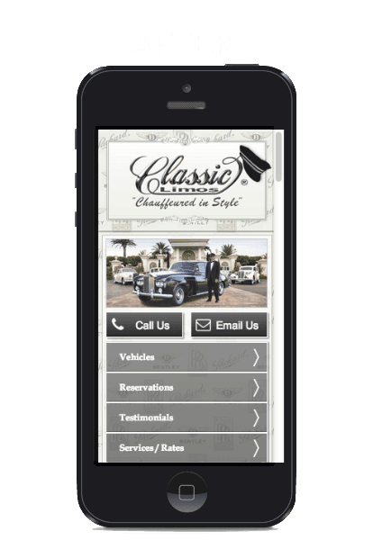
Mobile Responsive Web Design Benefits
Mobile responsive websites
are built with mobile applications such as click-to-call, mobile mapping, click-to-text, reviews, form submissions, hours, specials (coupons), social media integrations and much, much more. Plus, to truly benefit your company, we provide a built in social media share button for ultimate word-of-mouth social feeds.


